Styleguide
Every element the theme styles, in one place.
Every block below is a native Ghost element, styled by the theme. Open this page in the editor to see how each one is built.
Headings
Heading one
Heading two
Heading three
Heading four
Heading five
Heading six
Text
Body copy sits at a comfortable measure, with the display face kept for titles. It carries bold and italic emphasis, inline code, and links that pick up the accent colour set in Ghost admin.
Quotes
Nobody clapped. The silence was better.
The alternative style centres the quote and gives it its own marks.
We forgot you were there, which I think was the point.
Lists
- Unordered lists take a marker in the accent colour
- Items wrap against a hanging indent
- Spacing matches the body rhythm
- Numbered lists share the same measure
- The counter sits outside the text column
- Long items stay aligned
Tables
Tables come through an HTML card, and scroll inside their own frame when a narrow screen cannot hold them.
| Collection | Stories | Typical length |
|---|---|---|
| Weddings | 14 | A full day |
| Portraits | 10 | Two hours |
| Editorial | 2 | Half a day |
Images
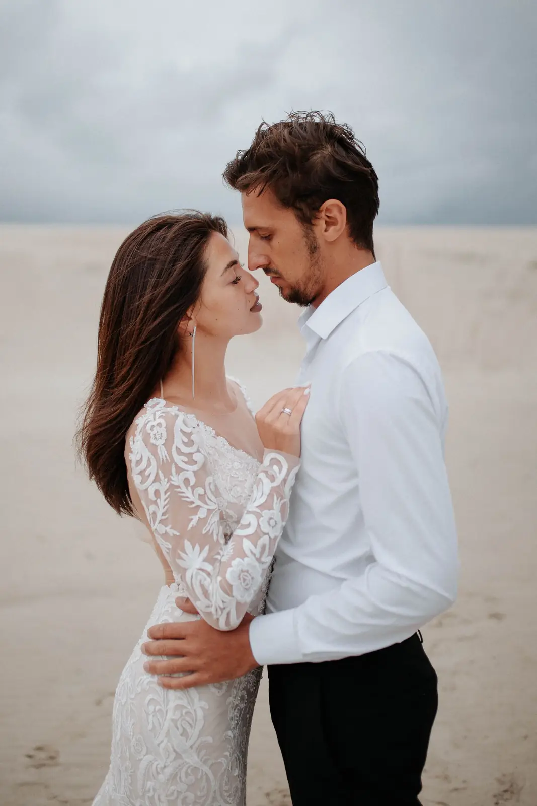
A regular image sits at the width of the reading column.
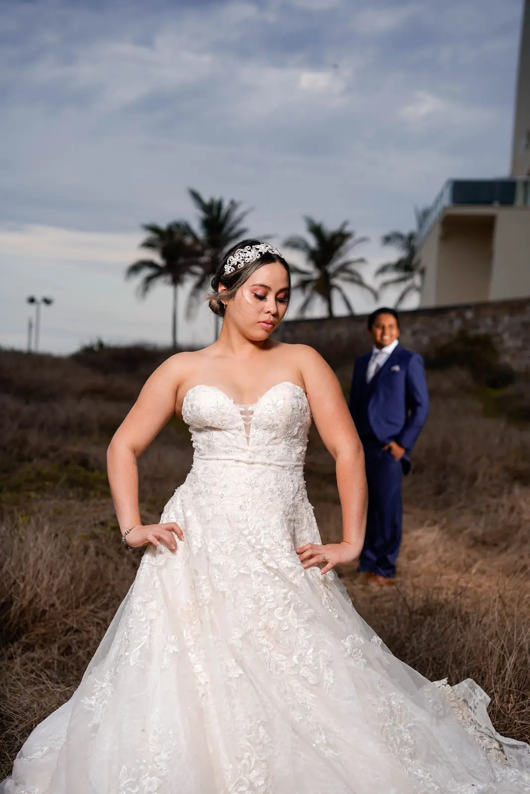
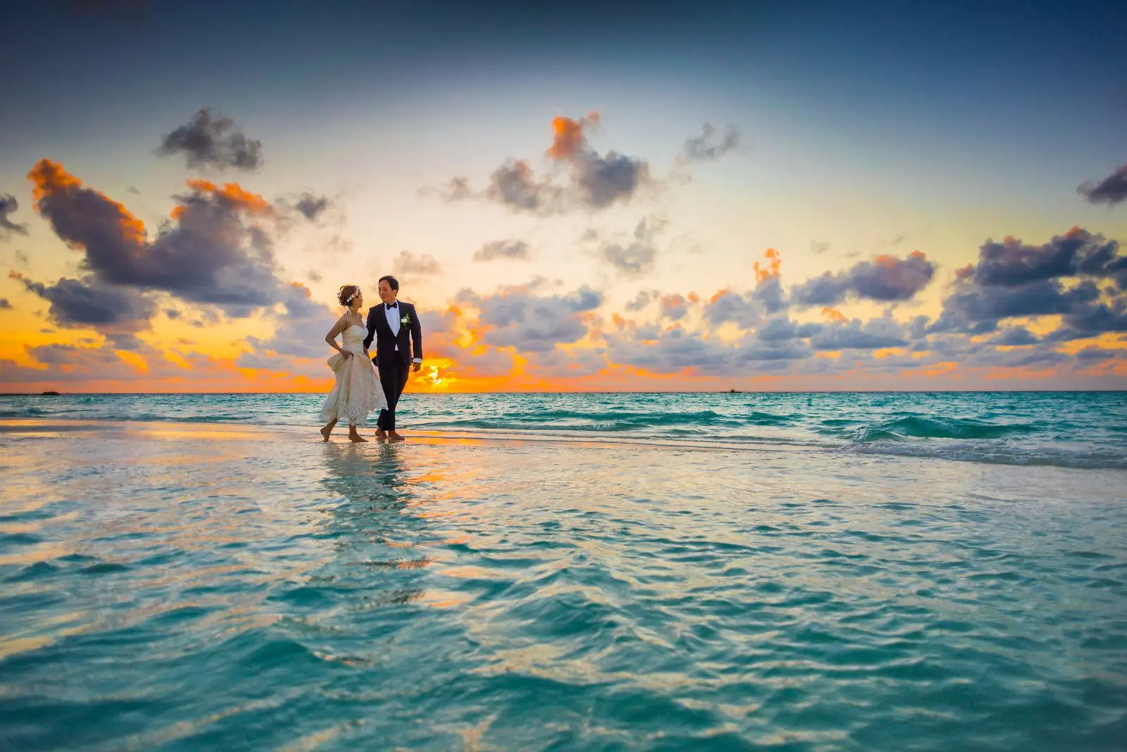
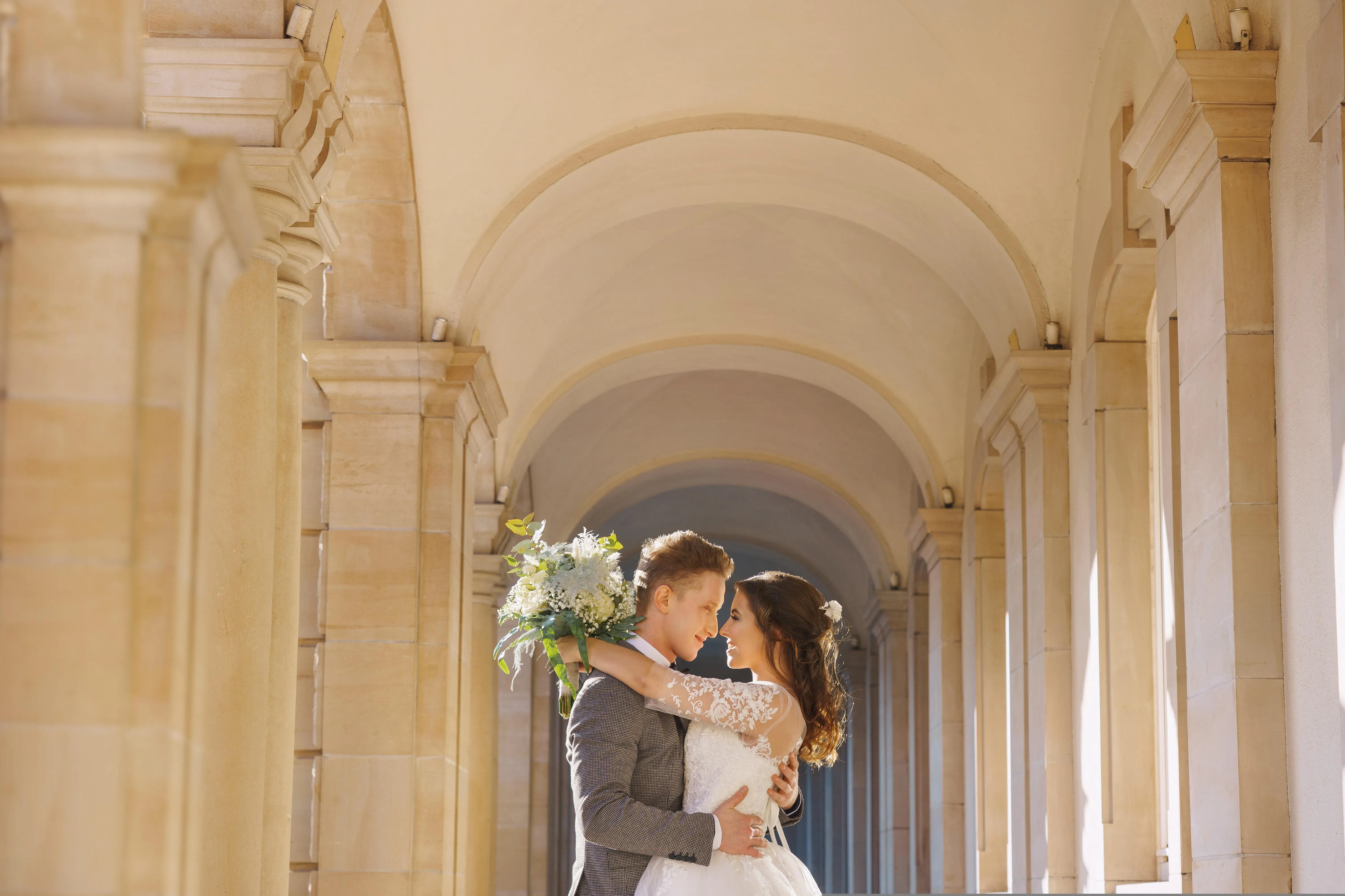
A wide image breaks out of the column, and a full one runs to the window edge.
Galleries
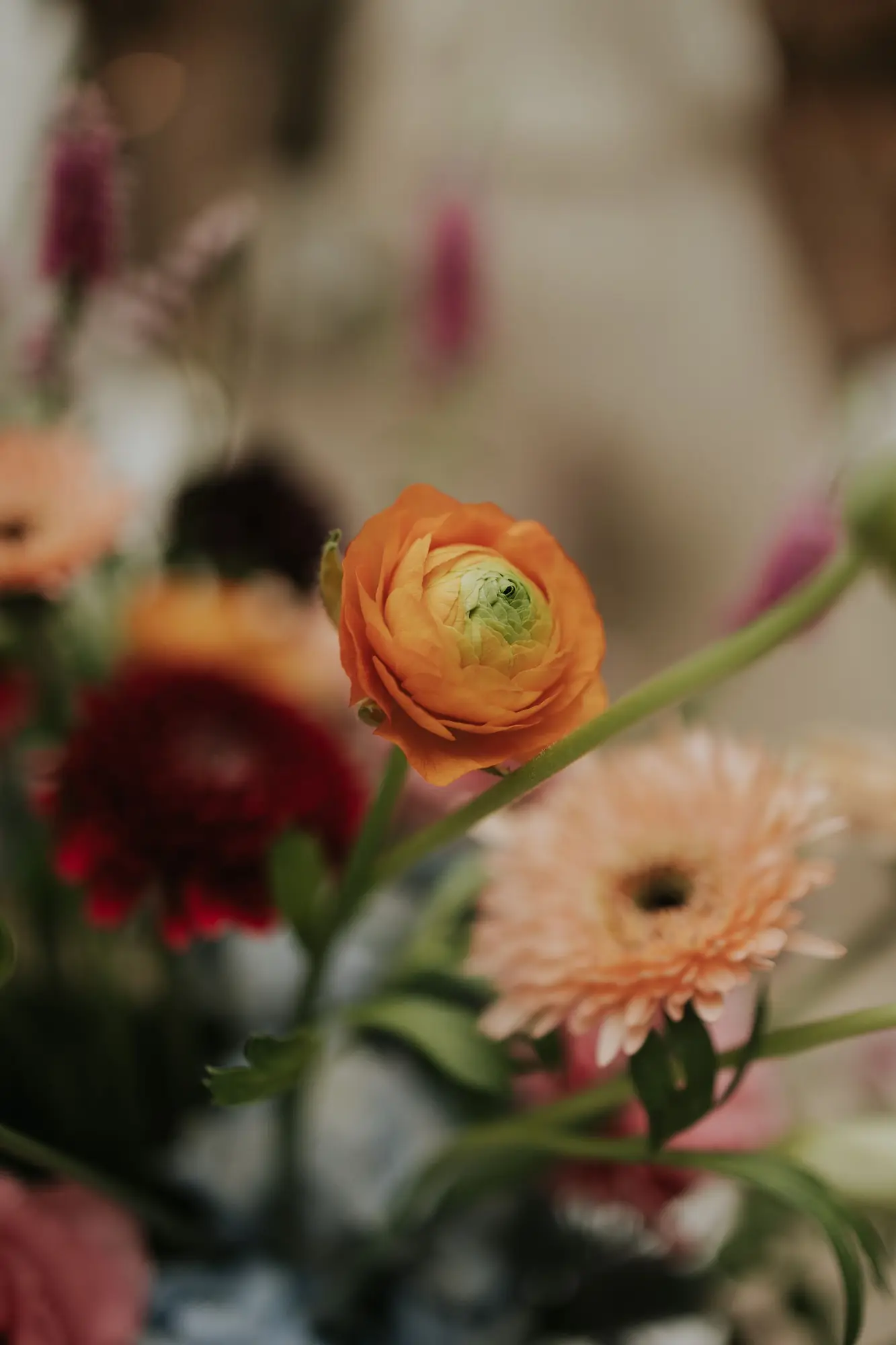
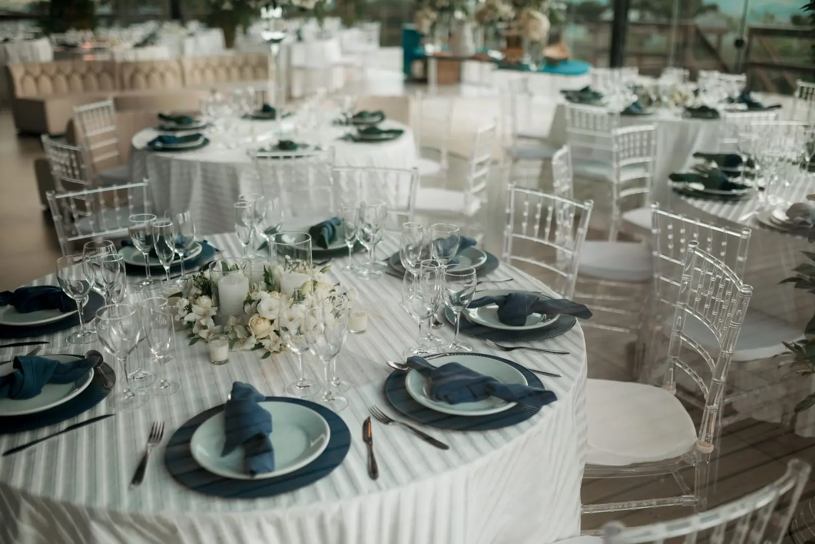
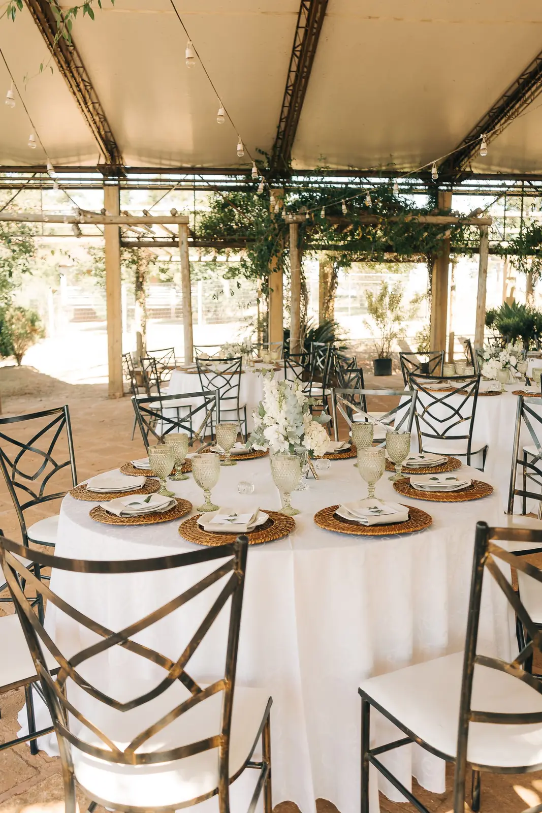
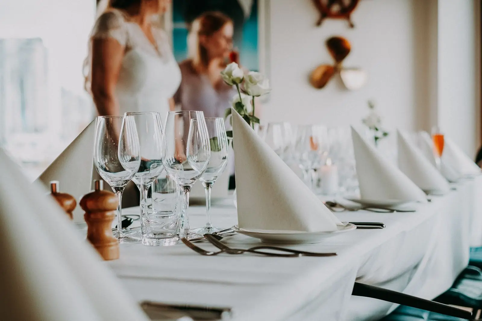
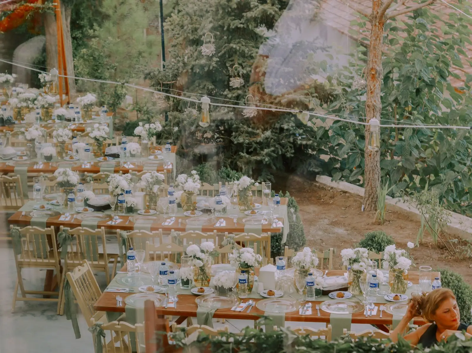
A gallery groups images into rows and always runs the full window. Clicking one opens the lightbox scoped to that gallery, with arrows, the keyboard and swipe.

Callouts
Toggles
A toggle hides detail until it is asked for
Useful for a list of what is included, a long caveat, or the answer to a question only some readers have.
Several can sit together as a short FAQ
Each one opens on its own, so a reader can take only the part they came for.
Bookmarks
Audio
Files
Buttons
Products
The full day
Embeds
Code
.gh-content .kg-width-full {
    width: 100vw;
    margin-inline: calc(50% - 50vw);
}Signup and header cards
Both run the full width of the window, for the top of a page or a break between sections.